Bold Colors to Transform Your Neutral Space
Introduction: Embracing Bold Colors in Neutral Spaces
We love a good neutral palette—it’s soothing, versatile, and works with almost anything. But if your space is feeling a little too safe or a bit bland, a few intentional hits of color can make a world of difference. It’s all about adding interest while keeping things polished. The good news? You don’t need to repaint your entire house or commit to anything wild. A few intentional pops of color can breathe new life into your space—without sacrificing that clean, elevated look you love.
At Mickler & Co., we specialize in helping busy homeowners create magazine-worthy interiors that feel as good as they look. Here’s how we incorporate bold color in a way that feels sophisticated, polished, and totally livable.
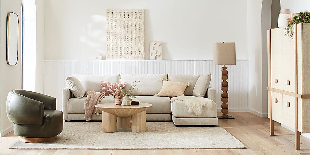
1. Earthy and Elevated
Think olive green, cinnamon, ochre, and deep navy. These colors feel rich without being overwhelming and add depth to neutral palettes in a subtle, refined way. They’re perfect for drapery, upholstery, rugs, or even a single accent wall. And they pair beautifully with linen, oak, and soft whites—so your space still feels light and natural, just with a little more personality.

Photo by Vanguard Furniture
2. Jewel Tones with Impact
Emerald, garnet, sapphire, and topaz aren’t just for jewelry—they’re stunning in interiors, too. These colors bring in that feeling of luxury and moodiness that so many neutral spaces lack. Try a velvet sofa in emerald green, or statement art in rich ruby and deep blue. These shades work especially well when layered into formal spaces, like dining rooms or home offices, where you want a bit more drama.

Photo by Devon Janse Van Rensburg via Unsplash
3. Sun-Washed Brights Inspired by Nature
Not all bold colors have to be dark or saturated. Coral, cerulean, and lime—when used intentionally—can feel fresh and effortless. They’re especially great in coastal homes, kids’ spaces, or anywhere you want to invite a little more energy. For example, a soft coral throw pillow or cerulean tile backsplash can brighten a room without clashing with your neutrals. The key is choosing versions of these colors that feel sun-faded or mineral-based rather than neon.

Photo by Toa Heftiba via Unsplash
4. Balance is Everything in Interior Design
The secret to using bold color well is restraint. One or two strong colors layered into an otherwise neutral space can make a room feel thoughtful and curated—not chaotic.We often start with one “lead” color and repeat it in small ways throughout the space—think drapery, throw pillows, artwork, or ceramics. From there, we build contrast with texture and tone rather than adding too many more colors.
While color trends come and go, the real takeaway is that everything goes. Your home should reflect YOU. We love helping clients infuse their spaces with personalized color palettes that feel authentic, intentional, and entirely their own.

Photo by Vanguard Furniture
If you’re ready to refresh your space but unsure where to start, working with a designer can make all the difference. We take the guesswork out of choosing colors, finishes, and furnishings so you get a home that’s not only beautiful but feels cohesive and intentional.
Whether you’re updating your primary residence or outfitting a luxury vacation rental, our goal is always the same: to create stunning spaces that reflect your lifestyle—and make you feel right at home.
Ready to Bring Your Space to Life With Some Bold Colors?
We’d love to help you bring in bold color that fits your style. Reach out to schedule a Discovery Call with our Wilmington, NC interior design team. Whether you need a little guidance or a full-service overhaul, we’re here to help you fall in love with your home all over again.