

Our Favorite Trending Fall Color Combinations
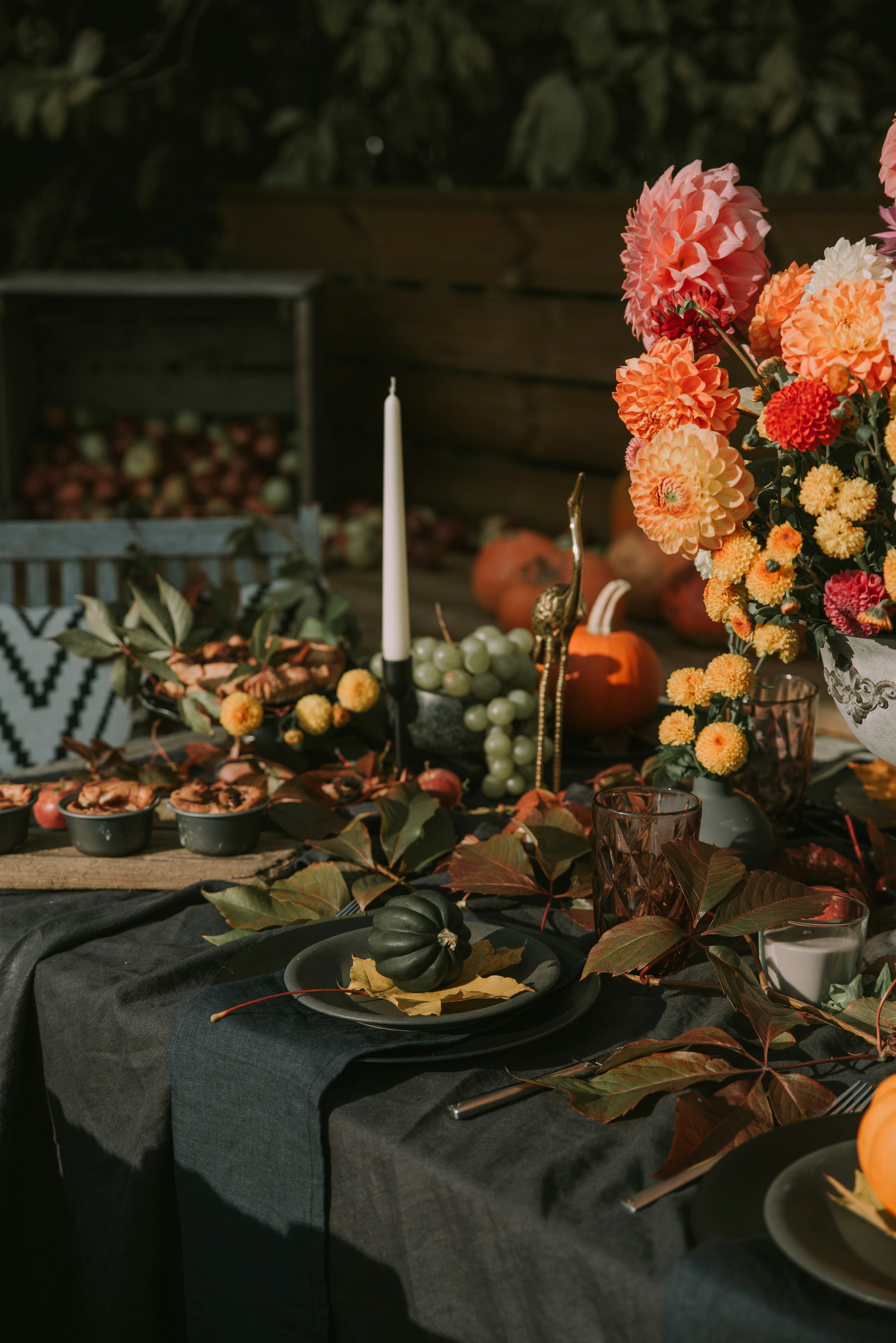
It’s time to wipe off the cobwebs on your fall decor!
This season, we’re loving color combinations that offer a fresh take on the traditional fall palette. They’re saturated, slightly surprising and proof that fall colors don’t have to be predicatable. Think beyond the usual burnt oranges and rusty reds and embrace unexpected pairings that bring depth, personality, and a little something extra to your home.
Here are a few of our favorite trending fall colors to inspire you to switch things up a bit this year.
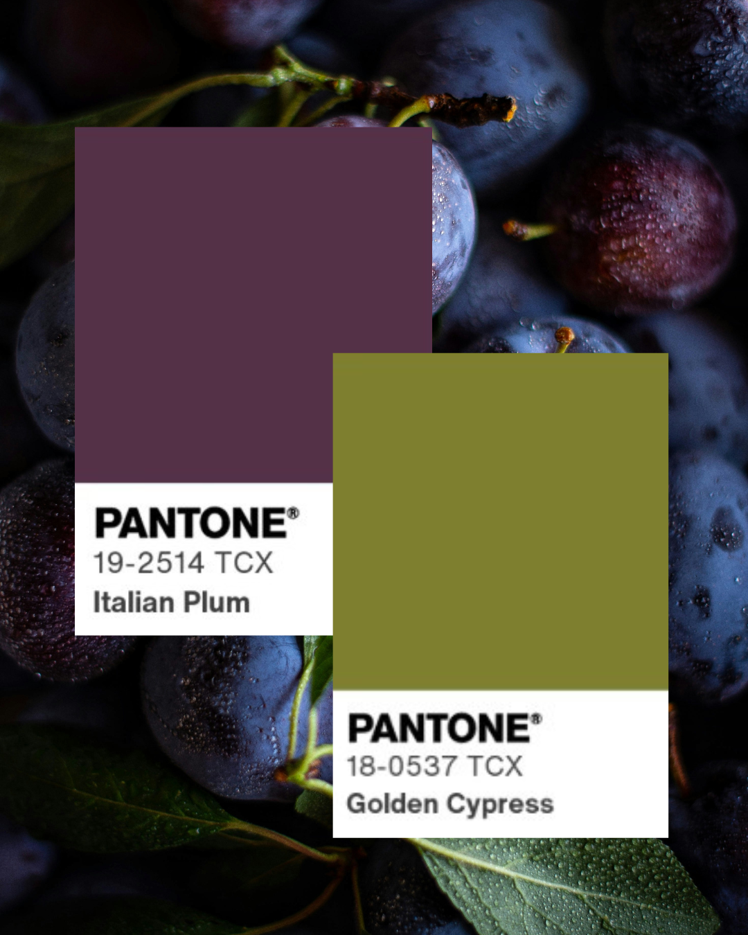
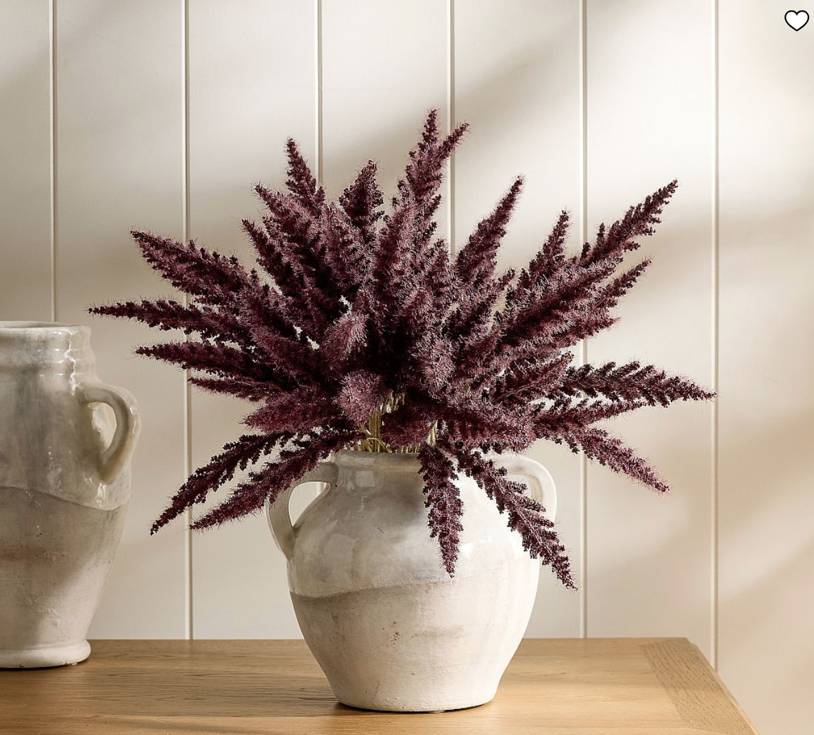
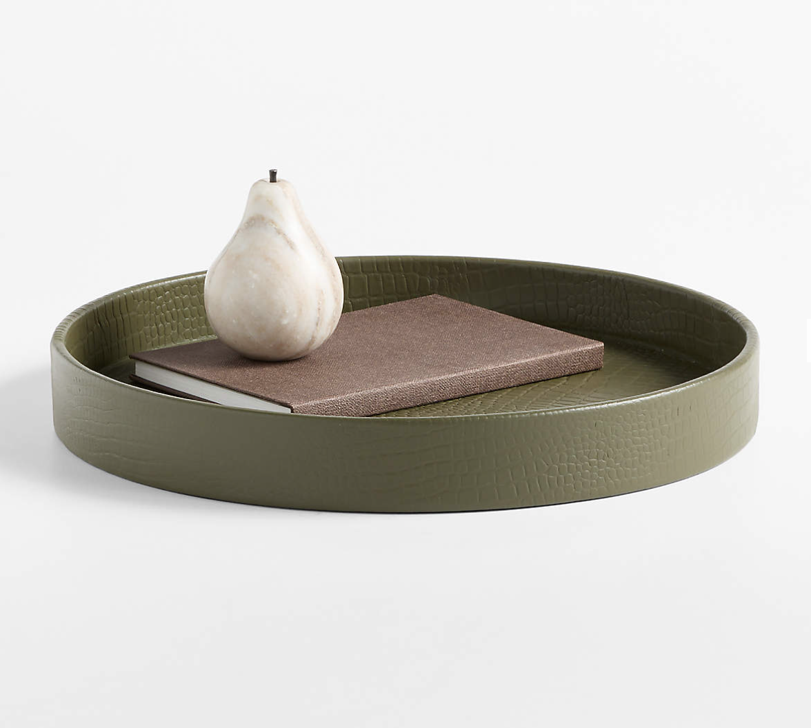
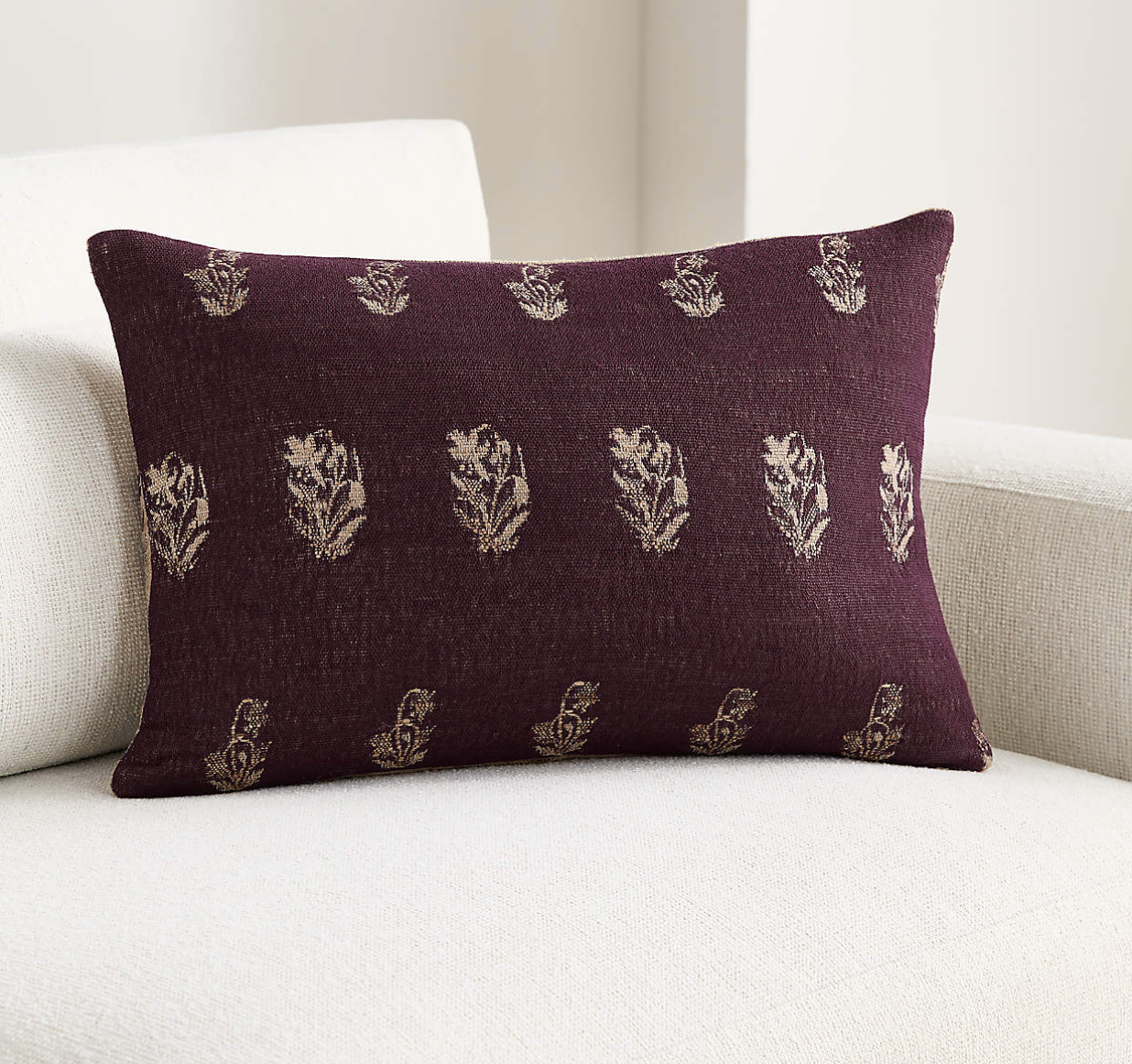
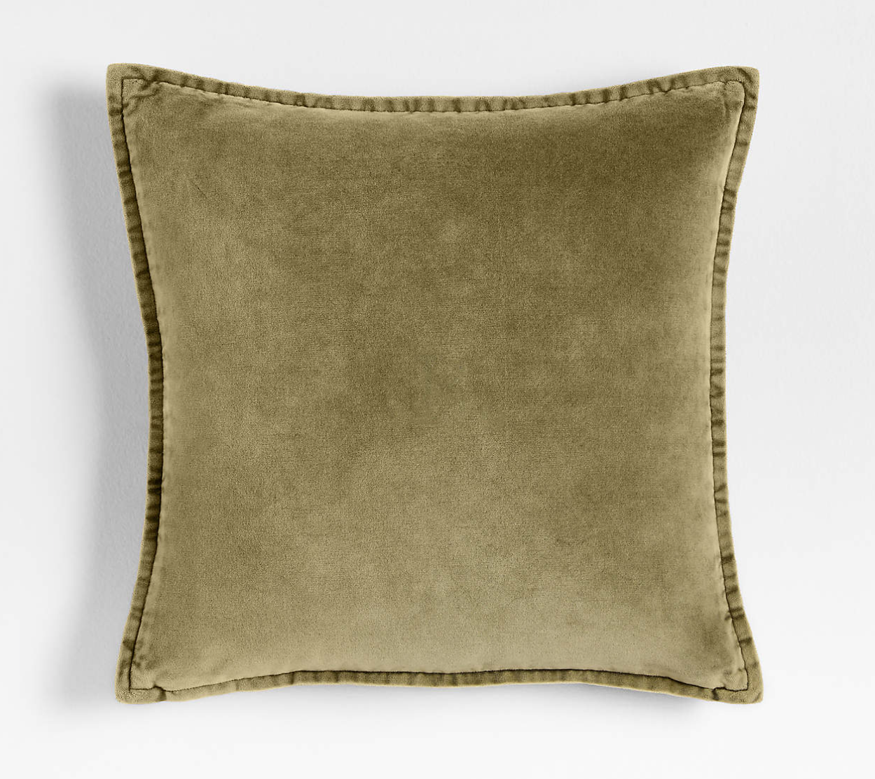
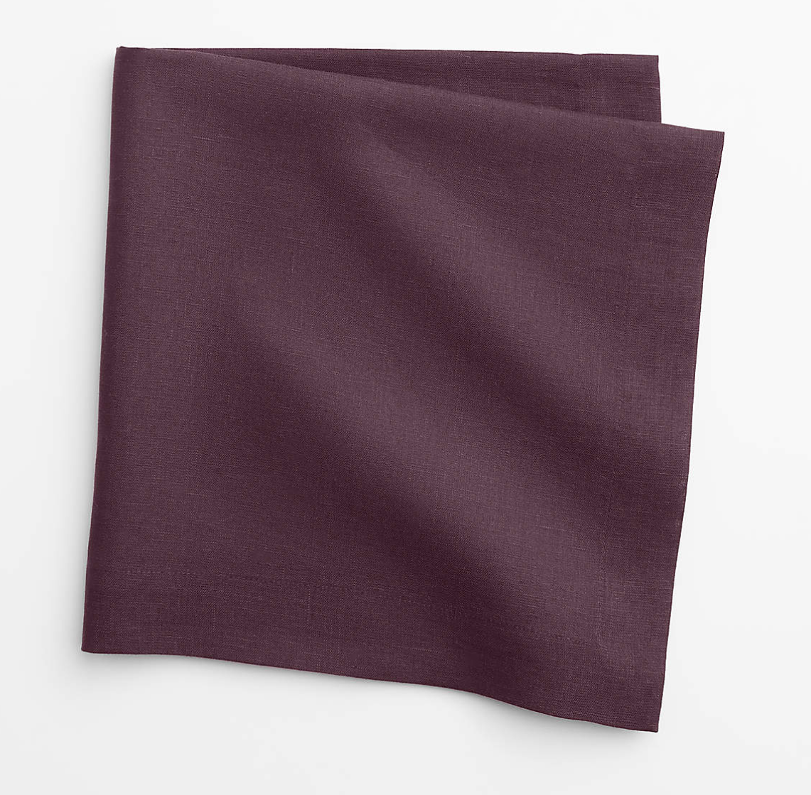
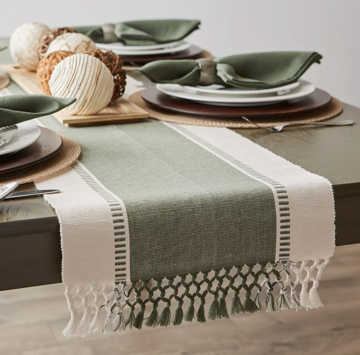
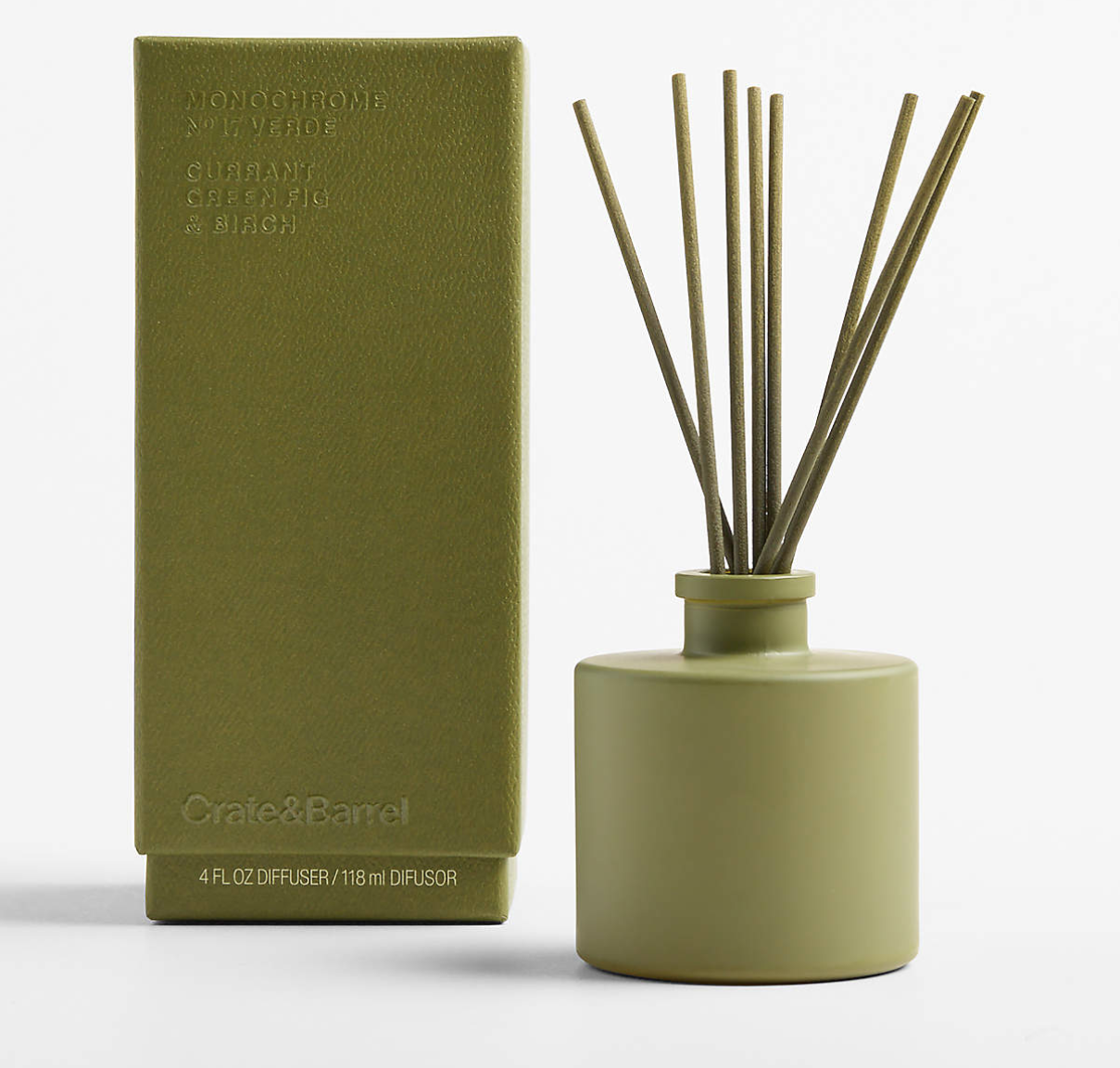
Plum Purple & Moss Green
For the moody and spooky lovers, plum and moss green bring the drama. Deep, earthy, and a little mysterious, this combination speaks for itself. There’s something effortlessly rich about the way these two shades work together, creating a space that feels cozy, layered, and just the right amount of unexpected.
Plum brings a moody sophistication, while moss green grounds the palette with an organic, earthy feel. Together, they create a look that feels inspired by the changing seasons without leaning too heavily into traditional fall decorating. It’s a combination that can feel dramatic and intimate while still being incredibly inviting.
This palette pairs beautifully with warm brass accents, dark wood finishes, and soft ambient lighting. These elements add warmth and depth, allowing the colors to shine without overwhelming the space.
Khaki, Chartreuse & Dusty Blue
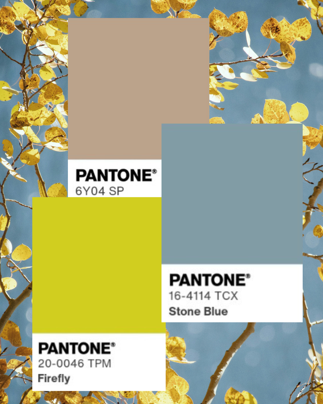
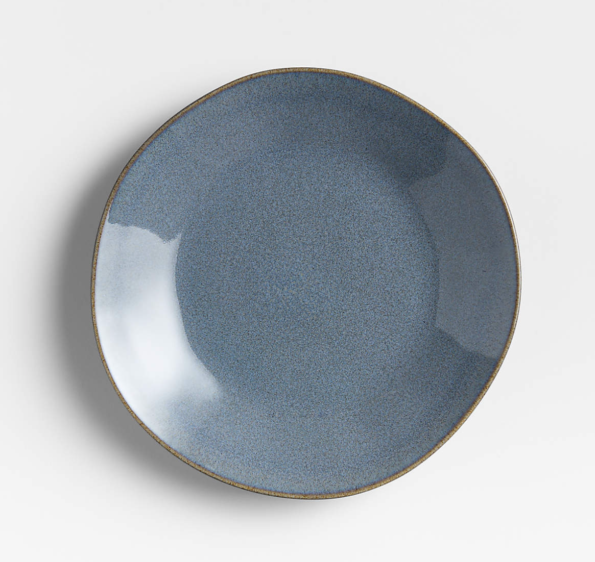
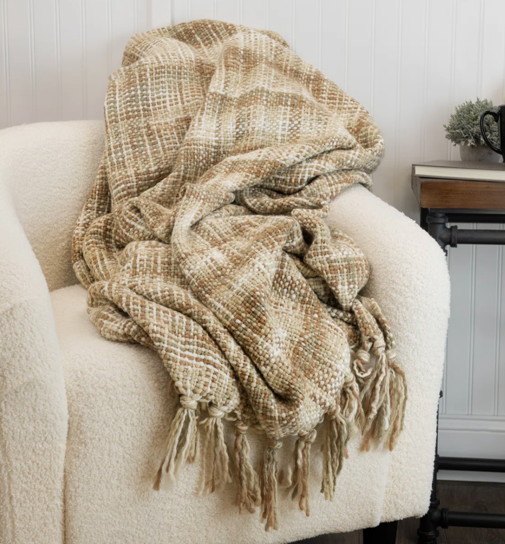
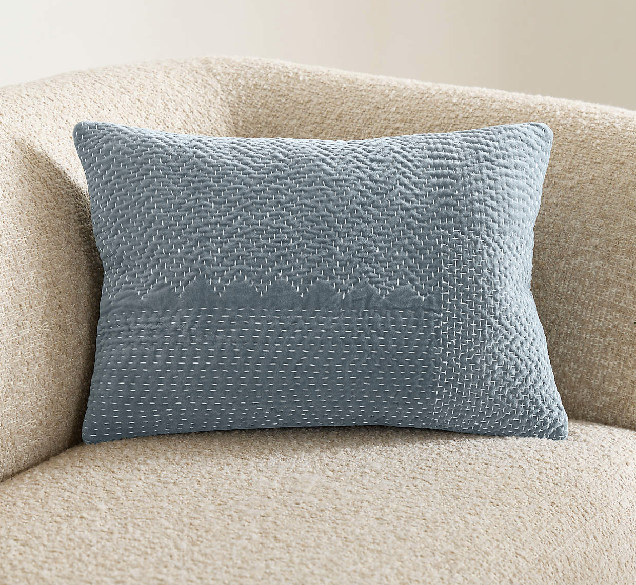
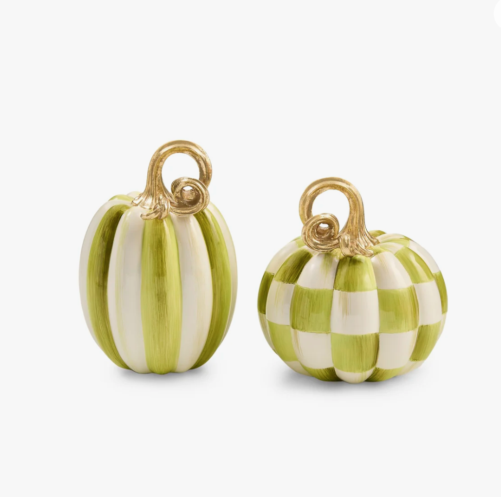
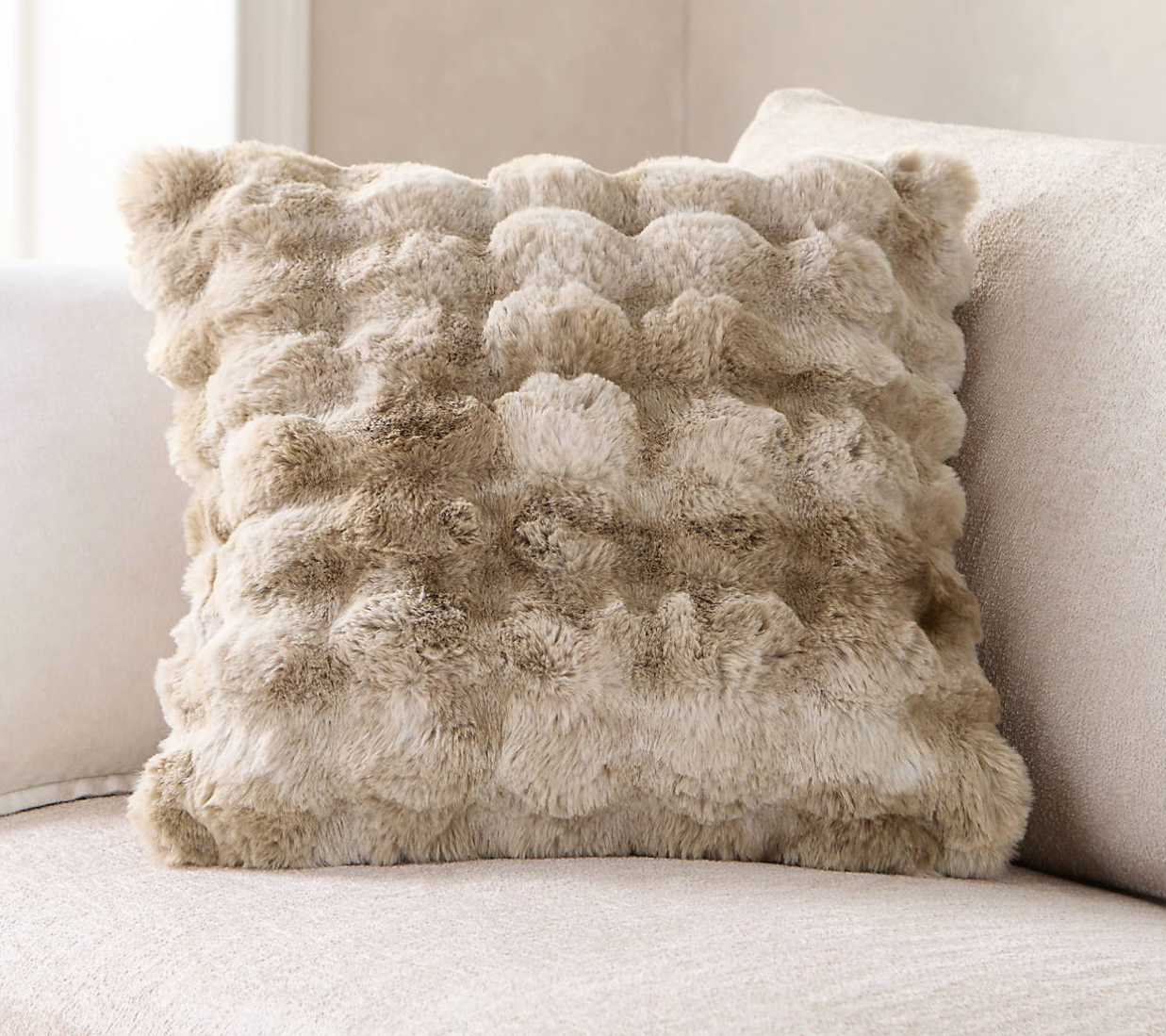
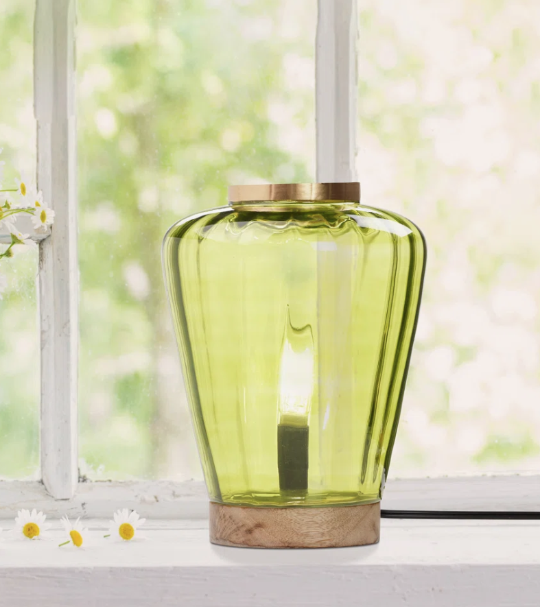
Fall colors don’t have to be dark - especially at the beach, where blue is always in season. Khaki and dusty blue create a relaxed, grounded base, while chartreuse adds an unexpected jolt of color that keeps the palette from feeling too safe. The result is a fresh, effortlessly coastal take on fall that feels warm and inviting without losing that light, breezy feeling we love.
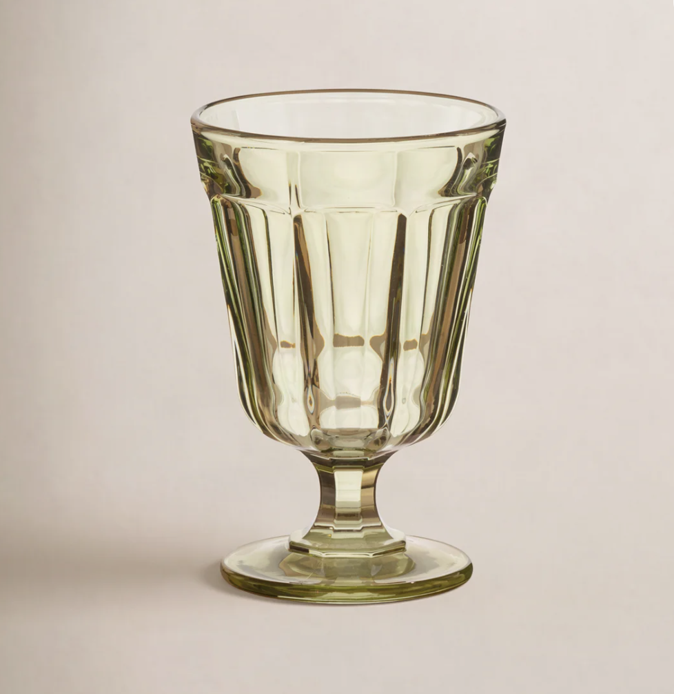
This combination is perfect for those who like to keep a light and airy interior throughout the season or those who don’t want their home to feel overly themed. Think soft khaki upholstery, dusty blue textiles, and small pops of chartreuse through accent pillows, artwork, ceramics, or even a beautiful arrangement of fresh greenery. You can let the brighter shade take center stage in small doses while the more muted tones do the grounding work.
Tip: If chartreuse feels like a bold step outside your comfort zone, opt for a medium tone green similar to the moss in the first combo!
Maple Red & Espresso
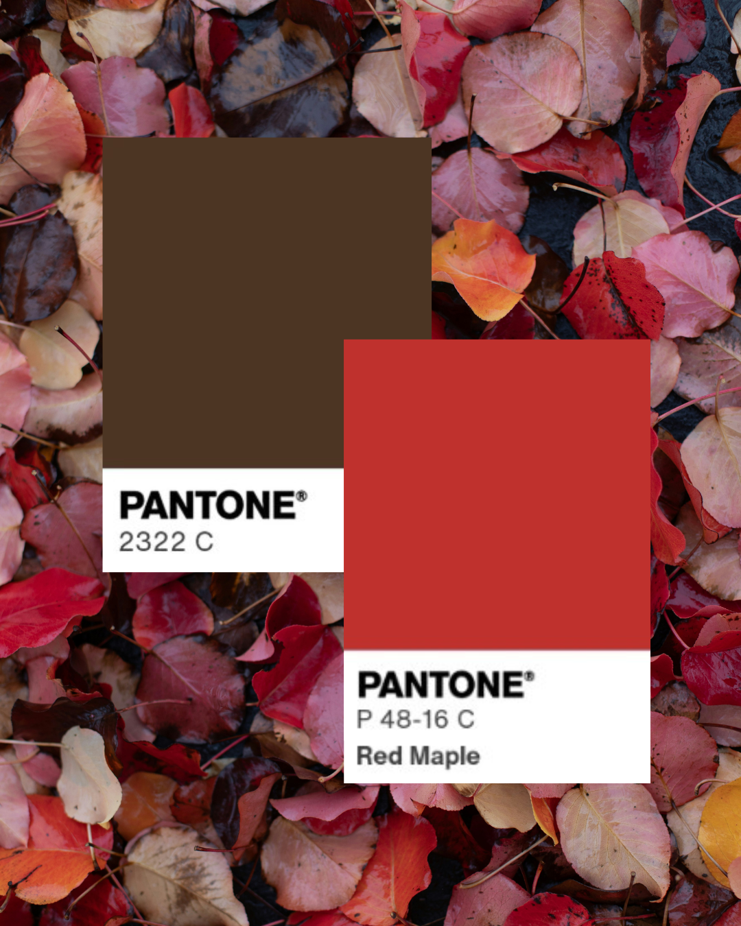
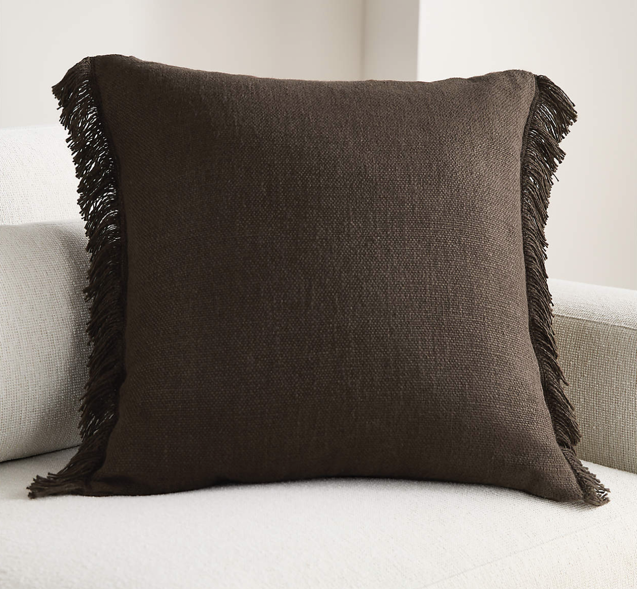
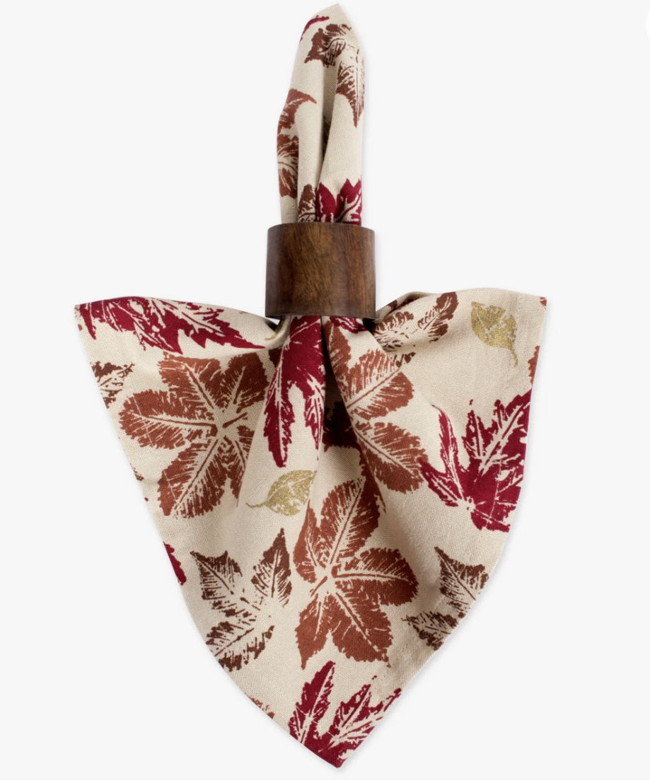
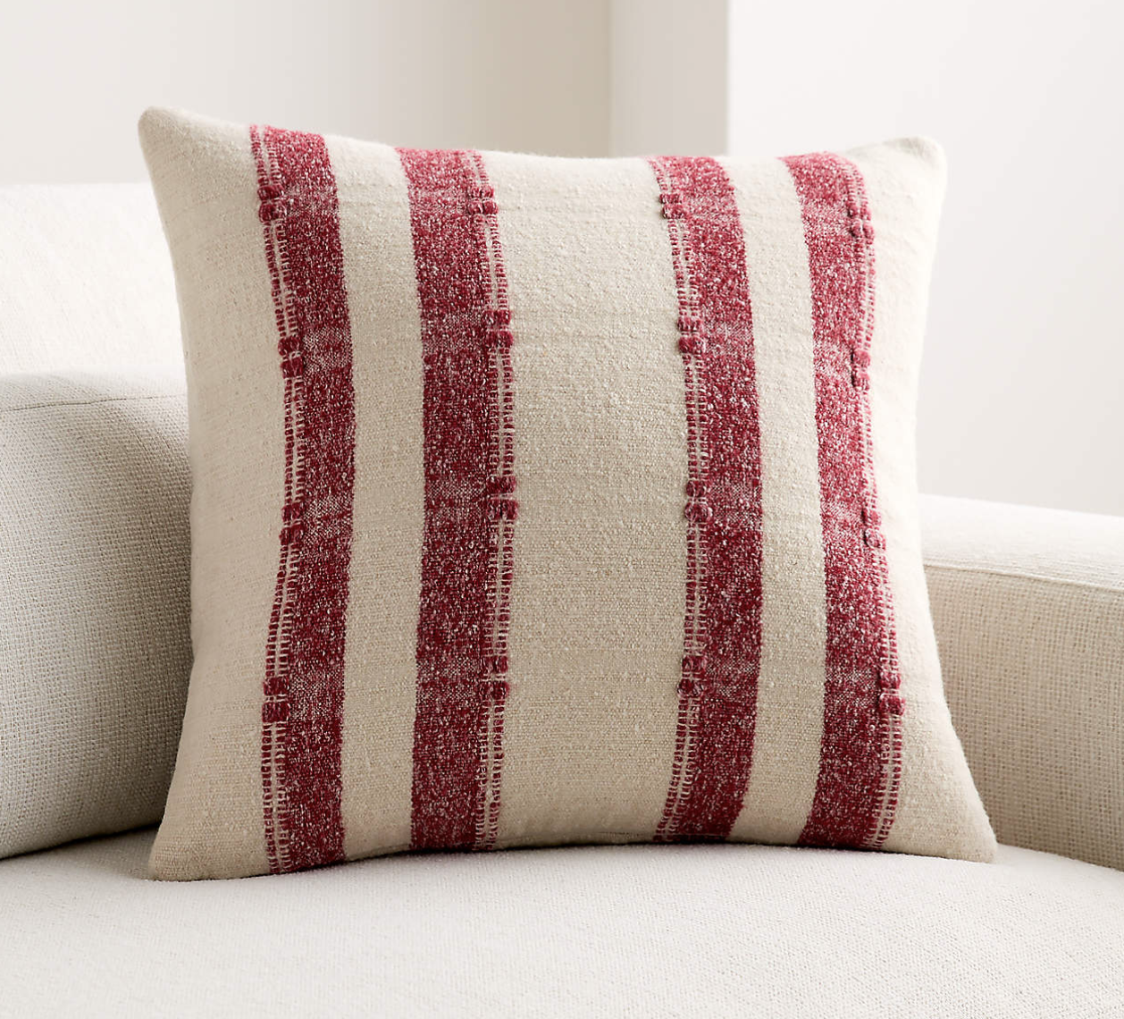
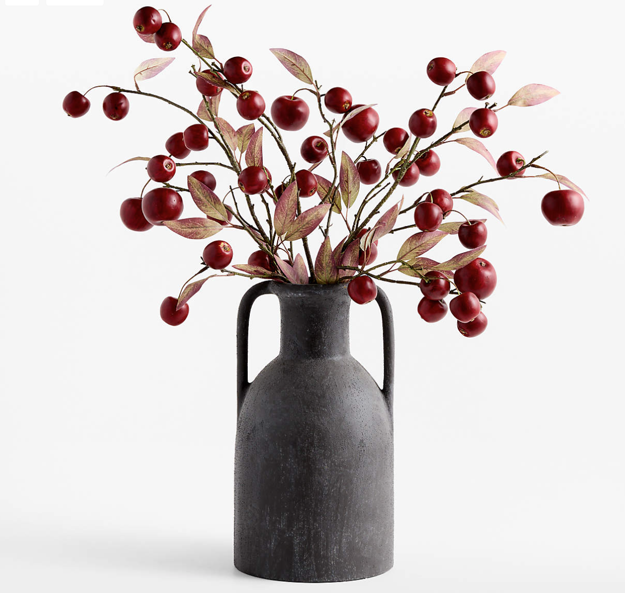
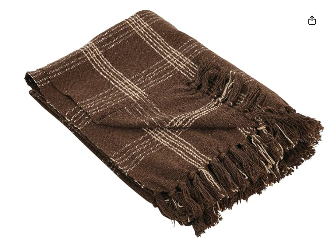
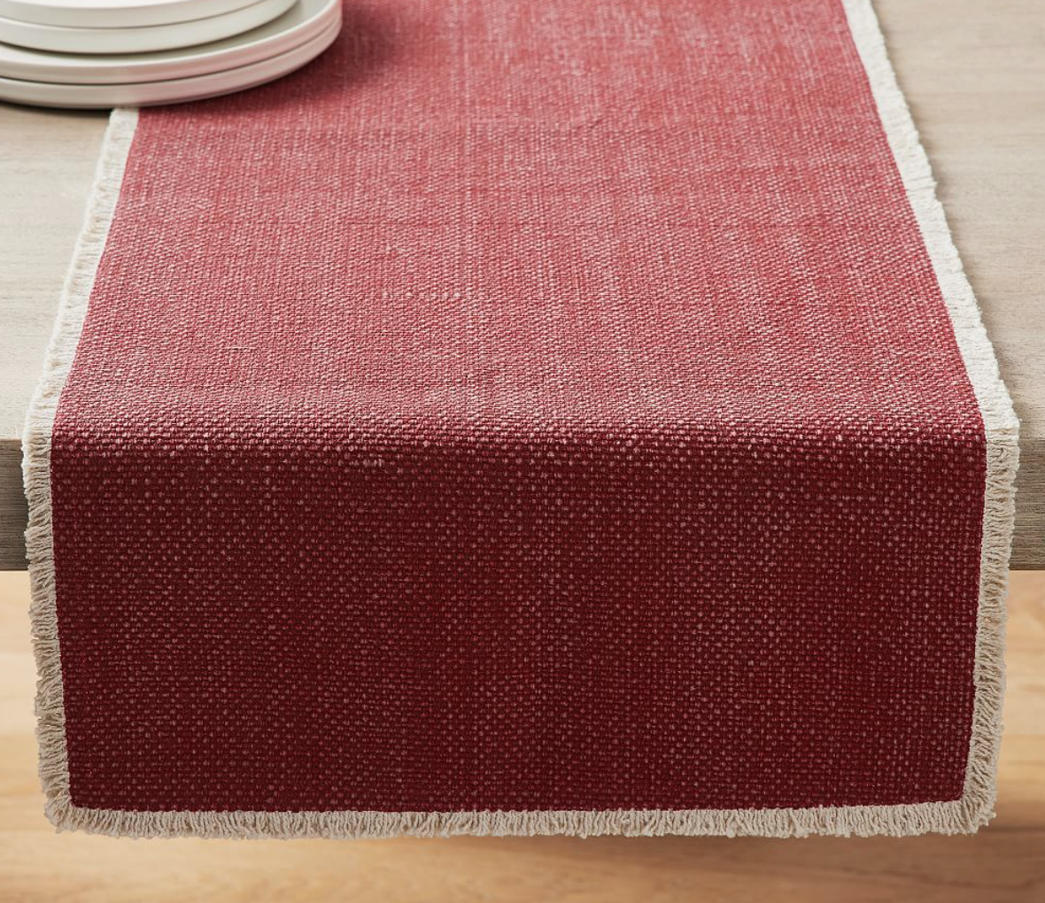
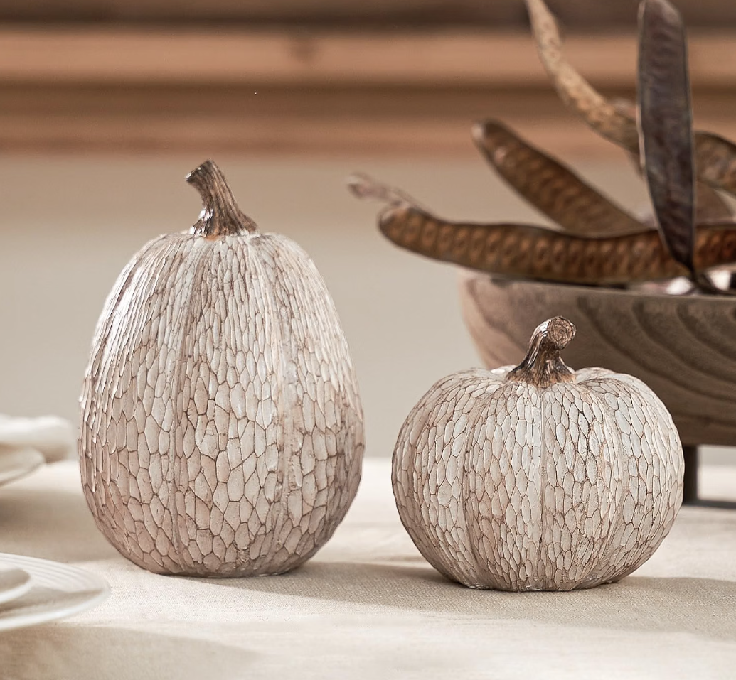
Espresso brown and maple red offer a slightly more sophisticated twist on traditional black and orange. Rich, inviting, and full of character, this combination is perfect for creating a space that feels cozy and elevated all season long.
Espresso brown brings a sense of depth and timelessness to a room, acting as a grounding neutral that pairs beautifully with a variety of colors and finishes. Maple red has that unmistakable fall feeling we love, but in a way that feels more refined and intentional than traditional seasonal decorating.
The beauty of this pairing is its versatility. It can lean traditional and cozy, feel a little more modern and moody, or bring warmth to a relaxed coastal home. The key is to let the deep brown provide a strong foundation while using maple red as an accent that draws the eye and adds seasonal interest.
Pro Tip: If you want to add in another color, try a saturated mustard yellow!
How To Implement A New COlor Palette without a full overhaul
You do not need to replace all of your fall décor to bring a new color palette into your home. Start with a few easy additions and mix them into the pieces you already love.
· Swap in new pillow covers
· Add a cozy throw to a sofa, chair, or bench.
· Refresh a main area with artwork, books, and decor.
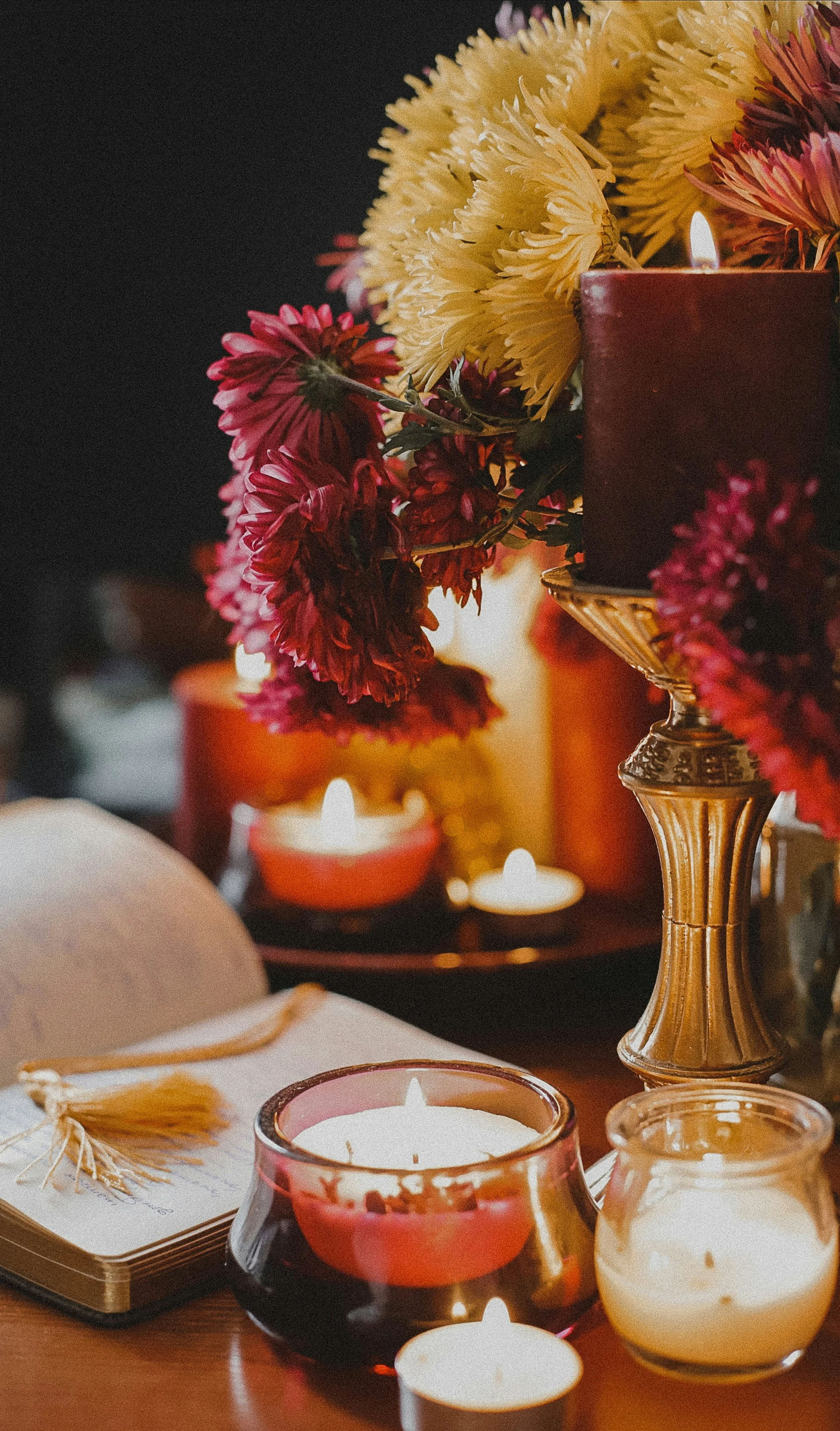
· Use candles and warm lighting to reinforce deeper autumn tones.
· Bring in a floral arrangement that repeats your chosen colors.
· Choose one accent color and echo it in two or three places for a collected look.
Even one or two unexpected colors can refresh an existing room and make seasonal décor feel more personal, playful, and connected to the way you live. This approach works especially well in coastal and beach homes throughout Wilmington, NC, where a lighter foundation might be difficult to pair with richer autumn accents.
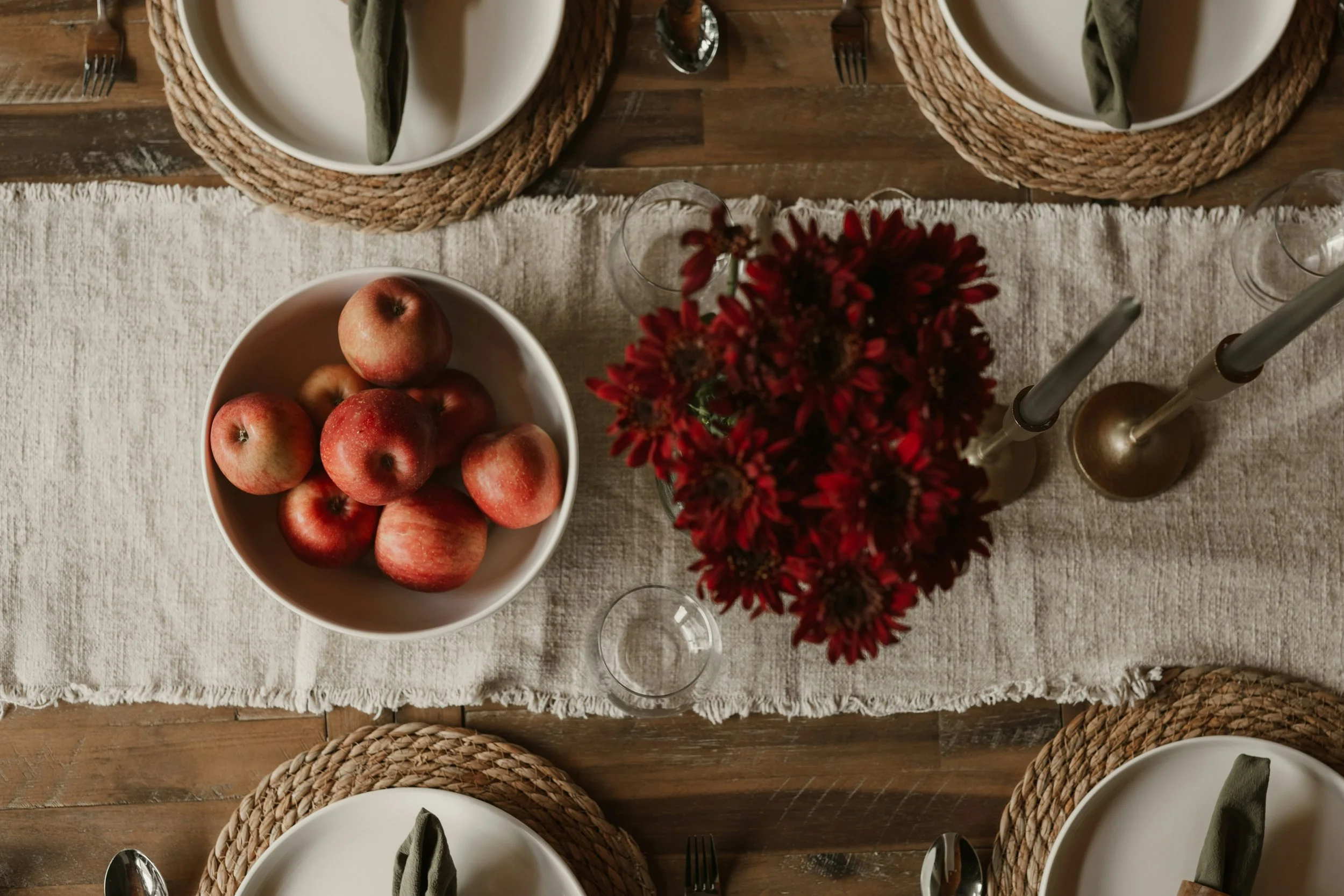
At Mickler & Co., we believe your home should reflect your personal style, and sometimes all it takes is the right combination of colors to bring a space to life. Not sure which palette works best for your home? We can help!
From figuring out the perfect color combination to bringing your seasonal vision to life, our team offers in-home consultations and decorative styling sessions designed to help you create a space that feels beautiful, layered, and uniquely yours. Whether you need a little guidance or a fresh set of eyes to pull everything together, we’re here to make decorating feel effortless and fun.
Ready to refresh your home for fall? Let’s find the colors, textures, and finishing touches that make your space feel just right.
Until next time,
Christa
Explore More Designer Tips & Tricks
FAQ’s
Q: What are the best fall color combinations for a coastal home?
A: Khaki, dusty blue, and chartreuse are a natural starting point because they preserve a relaxed coastal feeling while adding seasonal interest. You can also use maple red or plum as smaller accents against lighter neutrals.
Q: Do fall colors have to be dark and warm?
A: No. Fall palettes can include brighter accent shades. The key is balancing the colors with materials, lighting, and the existing tones in your home.
Q: How can I add fall color without buying all new decor?
A: Select pieces from your existing decor that work with the new palette then determine what you need to add to complete the look. Start with smaller, flexible pieces such as pillow covers, throws, candles, books, and floral arrangements. These updates can change the feeling of a room without requiring a major investment.
Q: How many colors should I use in a fall palette?
A: Begin with two main colors and pepper in a third. One color might be tied to your base furniture pieces such as taupe or brown. Select additional colors that work with your existing palette. Repeat accent colors in several small moments to help the room feel cohesive.
Not Local? No Problem!
We also offer virtual design services for homeowners outside the Wilmington area.